Frü
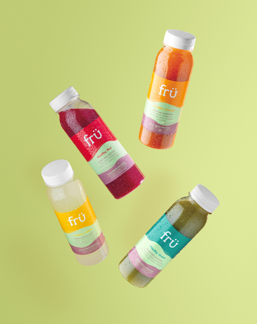
Frü was born from the urge of being a modern, healthy brand, made with quality products and committed to the environment. Inspired by the brand language and their positive speech, the starting point was to create a logotype that would reflect their philosophy, thus incorporating a smile within their identity.

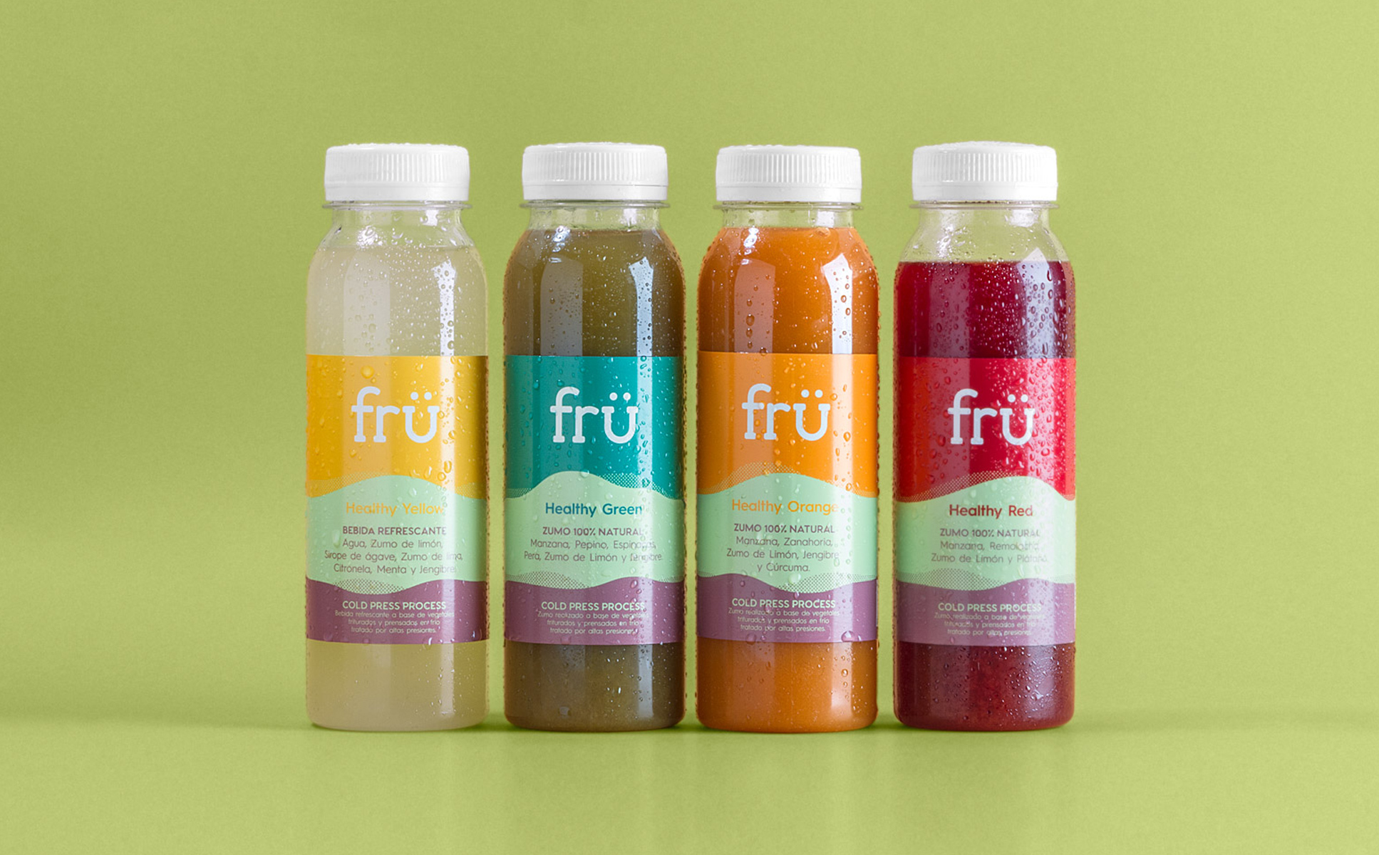
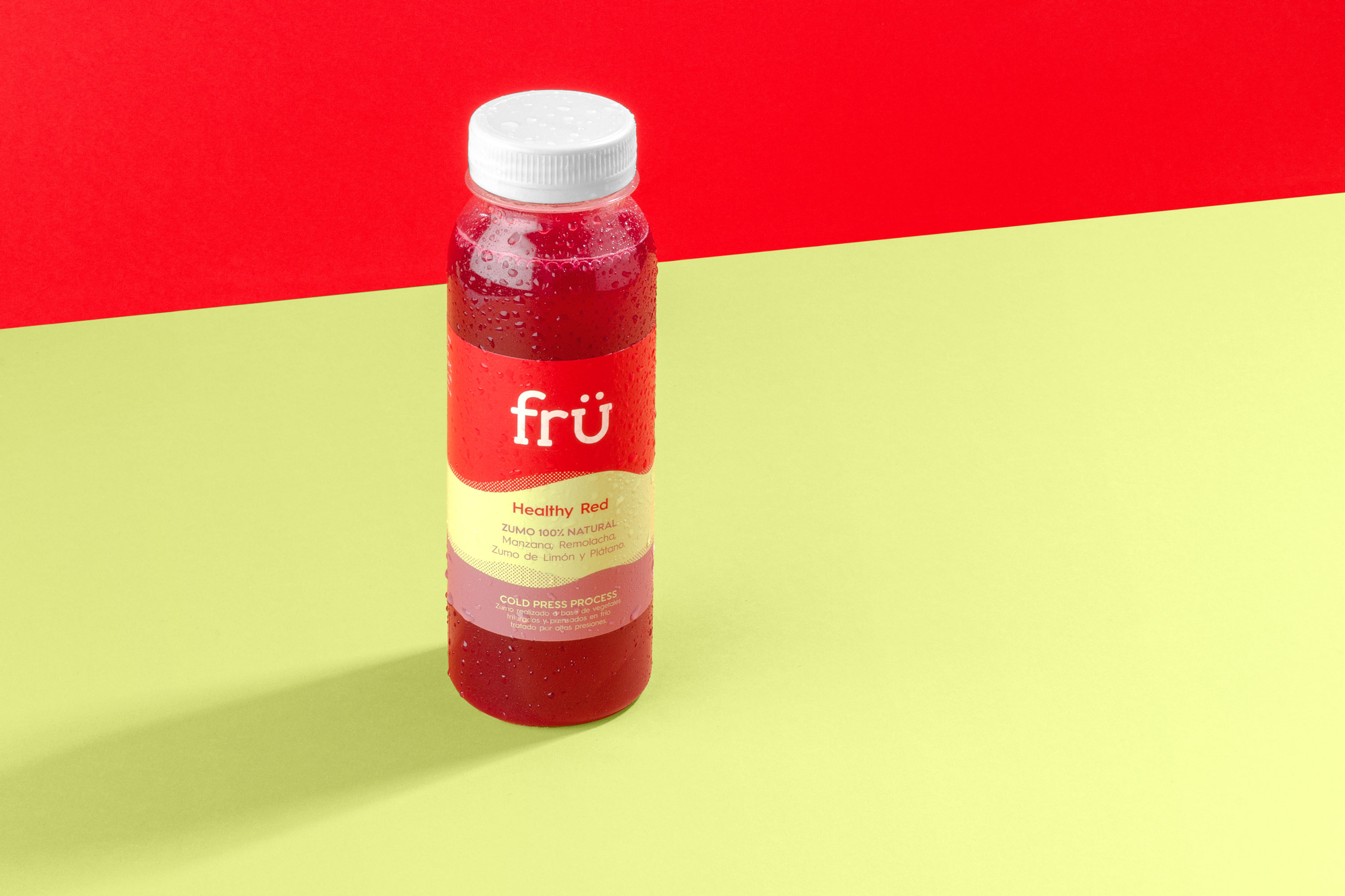
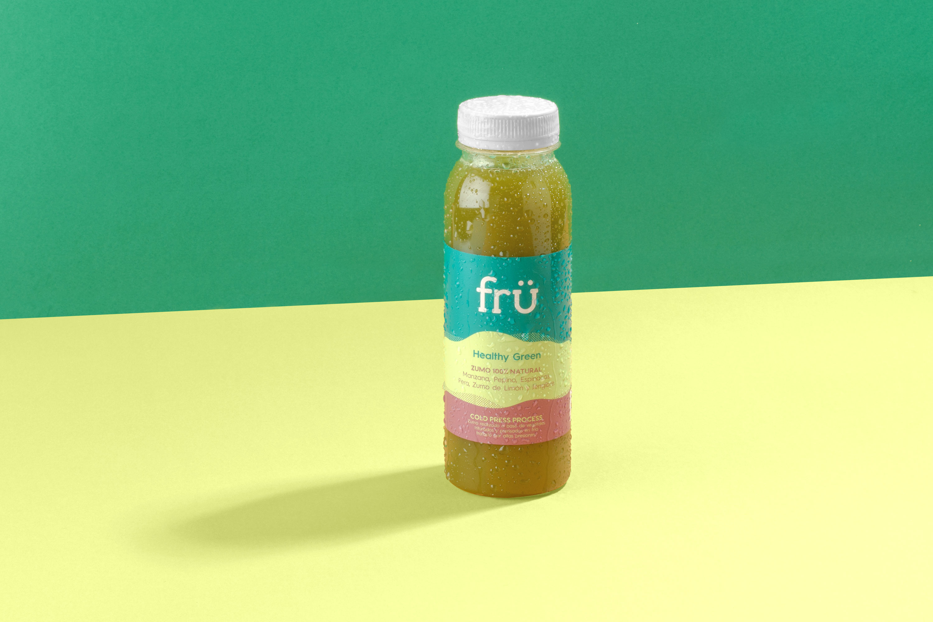
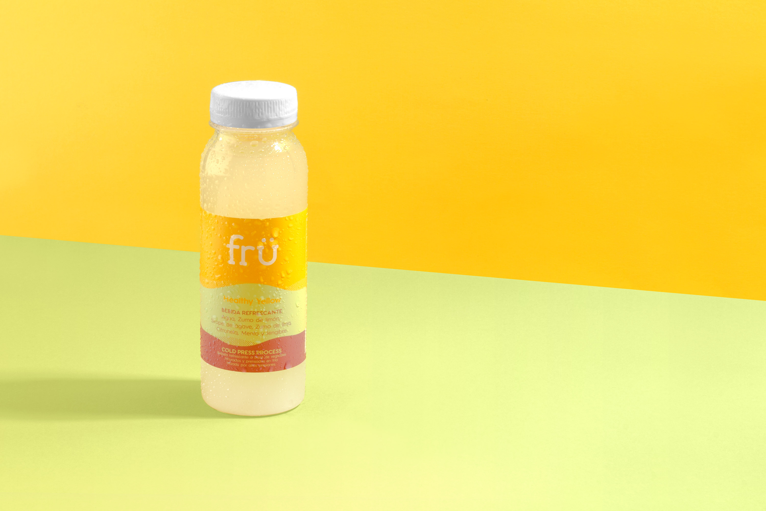
To demonstrate the naturalness of the product and the commitment to the environment with its 100% recyclable packaging, we have looked to transmit the honesty and freshness of the final product through a simple, recognizable, clear and modern visual code. For the label we have used a color palette inspired on the earth colors and their respective fruits, while for the composition we captured the movement of the soil during harvest, seeking to reflect its natural life cycle.
